
Engagement Center
How I reframed a legacy CRM around customer context to help agents resolve and document interactions faster.
Lead Product Designer | Focus: Enterprise CRM • B2B2C • SaaS platform
The Challenge
Agents had to search across multiple systems before they could understand the customer’s issue, making it harder to meet call-time targets.
The Solution
I redesigned the first screen around customer context, relevant alerts, and assisted documentation to guide agents toward faster resolution.
The Outcome
The experience reduced unnecessary navigation and manual work, supporting shorter calls and more interactions per shift.
About the Project
Engagement Center is a cloud-based SaaS CRM created to replace a legacy customer service platform.
Rather than simply transferring the existing experience to the cloud, I used the redesign as an opportunity to rethink how the CRM could better support agents during live customer interactions.
Discovery & Challenge
The legacy CRM opened with an interaction form focused on documenting the call.
Through user research, I found that agents needed something different at the start of the conversation: a clear view of the customer, their products, billing status, open cases, active orders, recent interactions, and account alerts.
Because this information was scattered across multiple systems, agents had to search for context while the customer waited, making it harder to resolve calls within the expected three-minute target.

My Design Thinking
I reframed the CRM around a simple principle:
help agents understand and resolve the interaction before asking them to document it.
The experience was designed around the operational goals agents were measured against, including completing calls within approximately three minutes and handling more interactions during each shift. This led me to prioritize immediate customer context, relevant alerts, guided actions, and reduced manual documentation.
Design Improvement #1
From Interaction-First to Customer-First
Instead of opening with a documentation form, I proposed a Customer 360 workspace that surfaced the most relevant customer and account information upfront.
The design gave agents an immediate understanding of who the customer was, what might be affecting them, and where to begin.
Although the direction initially faced resistance from Product and Architecture, I used research findings and real workflow examples to show how presenting context earlier could reduce searching, system switching, and call duration.
This reduced the time agents spent searching for context and helped them begin the investigation earlier in the call.


CRM Landing page. After (Customer 360) vs. before (Interaction home)
Design Improvement #2
From Manual Documentation to Assisted Completion
Research also showed that agents often postponed documenting interactions because the manual form interrupted their workflow. Keeping the interaction open after the call effect their score and KPIs.
I explored how documentation could become a by-product of the work itself.
The proposed experience used voice-to-text for call summaries and automatically captured actions performed during the interaction. Instead of writing everything manually, agents only needed to review and confirm the generated summary.
This reduced the administrative work required to close an interaction and supported faster call completion.

End Interaction. The closing experience simplifies documentation by automatically capturing completed actions and using voice-to-text to add any missing context.
The Result & KPIs
The final CRM combined a context-rich Customer 360 workspace with assisted interaction documentation, reducing system switching, surfacing relevant issues earlier, and minimizing manual input.
The platform was adopted by Claro Puerto Rico across customer service and retail operations. Its UX also served as the foundation for Cellcom’s CRM modernization, which achieved a 10%–20% increase in agent productivity and an 80% reduction in new-agent training time.
Key Insight
I learned that effective workflows should reflect how users actually work, rather than simply optimize screens around business processes defined by the business or inherited from the existing system.
Faster experiences do not come only from removing steps, but from understanding the user’s complete task and prioritizing the right information at the right moment—helping users recognize what matters, focus their attention, and move confidently toward the next action.

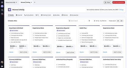
More designs from the project. Subscriber page & Browse catalog for new order
My Role in the Project
As the Lead Product Designer, I defined the product experience strategy and led a team of five designers.
I also did lots of hands-on too, conducted the research, translated user behavior into the design direction, aligned Product and Architecture around the customer-first approach, and guided the experience from concept through delivery.


