
Reducing Friction Across Telecom Self-Service
How I designed key workflows and reusable patterns to reduce friction, support faster decisions, and help users complete common tasks with confidence.
Product Designer @ Amdocs | Focus: B2C, Responsive Web, Information architecture
Project Overview
Telecom providers offer different self-service capabilities depending on local regulations, customer behavior, and business needs.
The goal was to create a set of reusable guidelines and best practices for future self-service projects, while demonstrating how Amdocs’ core capabilities could be adapted to each provider’s journeys, content, and available actions.
Rather than designing every possible flow, we focused on the most common and valuable self-service scenarios across telecom providers.
Design Approach
Although the initial request focused on designing the required flows, we wanted to use the opportunity to improve the broader purchase experience.
Through user research and benchmarking across leading e-commerce products, we created personas and mapped them onto the defined journeys.
This helped us look beyond the happy path, identify potential friction at key decision points, and design clearer guidance, stronger feedback, and faster ways for users to complete each task.
Fast Top-Up Use Case
Scenario
Users often need to add balance quickly, with minimal effort and without uncertainty during payment.
The goal was to reduce friction and encourage users to complete the top-up process confidently.
Experience
The flow supports several fast paths: repeating the previous top-up, selecting a preset amount, entering a custom amount, choosing a saved card, or scanning a new credit card using the mobile camera.
Design Decisions
We prioritized speed, clarity, and trust. Previous top-up details and saved payment methods were surfaced to reduce repeated input, while preset amounts simplified decision-making. Card scanning shortened manual entry, and clear selections, payment summaries, and status indicators helped users understand what was selected and what would happen next.
What I Took Away
Fast experiences are not created by removing every step, but by reducing unnecessary decisions and reusing information the user has already provided. Designing around familiar choices and visible confirmation can make even a sensitive payment flow feel simple and secure.

Reducing Friction Across Key Journeys
.png)
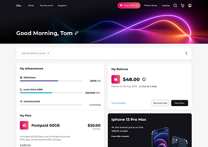
Customer Landing Page
Surfacing balance, usage, and next actions in one place helps users understand their status quickly and reduces the need to search across multiple areas.
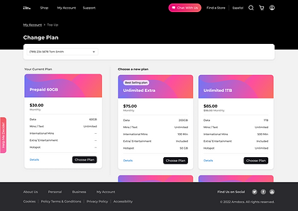
Change Plan - Plan Selection
Showing the current plan alongside alternative plans makes comparison easier and reduces the friction of choosing the right upgrade.

Review Cart
A clear cart structure, secure payment cues, and transparent pricing reduce checkout uncertainty and help users proceed with confidence.
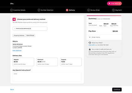
Checkout
A focused checkout removes unnecessary navigation, keeps the cart and total visible throughout, and provides immediate chat support - reducing distraction and uncertainty while helping users complete the purchase confidently.
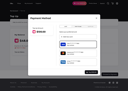
Payment Method
Saved cards, clear payment amount, and multiple payment options reduce input effort and support a faster, more confident checkout.
My Role in The Project
As a Product Designer on the team, I was responsible for designing selected features and workflows within the self-service experience. My work included preliminary user research, competitive benchmarking, reference analysis, interaction design, and detailed UI design.


